 The internet, with all its magical ability to make something out of nothing, can sometimes be rather limited in its lack of physicality. It’s getting there, what with bar code scanners and wifi on your phone, but it still doesn’t quite replace a little bit of paper with all your personal bits on. These personal bits are then used to lure people in and seduce them into buying whatever it is you have on offer, so they had better be well presented.
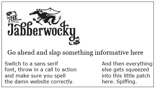
Having spent an oddly satisfying morning scraping crumbs out of cracks in the toaster I decided to attack the next job on the pre-food-festival list and rustle up some business cards. My experience in business (season 1 of Mad Men) has taught me that they are indispensable, and personal experience has taught me how important it is to have something to wedge under wobbly restaurant tables and for impromptu card house construction. It is also an inexpensive way to advertise on the fly, and to sneak your logo and brand into another person’s wallet, bag or display cabinet (when they become collectors items). Not only that, this is one of the very few kinds of advertising that people will actually ask for. The problem, really, is to know when to stop, because the medium of the business card is a relatively small space in which one has to elegantly cram an awful lot of information.
The logo, clearly, needed to take pride of place. What’s the point in having one quite this good if you’re not going to smear it everywhere like an over-tired toddler with a lipstick. Then all the usual contact details, the twitter feed (because we’re cool) and our mission statement. Interesting. I moved the “your mission statement here…” box idly around the card, wondering where it should live, and found an interesting home for it on the back. However unless we actually felt that ![]() was an appropriate tagline, I was going to need something a little snappier.
was an appropriate tagline, I was going to need something a little snappier.
So Barny and I began doing whatever the P.C. term for brainstorming is and came up with a few different ideas for something that would sum up our business and make everyone instantly like us in no more than 5 words. Ideas included:
Artisan Satisfaction
Feed your Taste-buds
Feed you Mind
All About the Noms
Nothing really seemed to work, and Barny was late for the evening shift so had to dash off, leaving me to pick a design and fill in that final text box. I appreciate that technically I could have easily left it blank, a calm little mote of emptiness for notes and reflections, but I like words. More than that: I love words; the way they can sway a vote or bring you to tears or do nothing at all, just by being in a different order. So rolled a few words around and settled on “Curiosity tastes good.” which I may or may not grow to dislike later.
It’s done now. I have checked all the boxes to confirm that there are no spelling mistakes I will regret later and I have shot my wad of cash into the internet. I can now do nothing more than wait and see what comes of it.


